Conflicting color usage for issue status indicator #6795
Replies: 11 comments 6 replies
-
|
Hi @AlexV525, thanks for the feedback! It was very insightful and has been shared with the product team. Cheers! |
Beta Was this translation helpful? Give feedback.
-
@timoyates Thanks for noticing this. State misleading should not happen in such great projects, at least it should be opt-in. |
Beta Was this translation helpful? Give feedback.
-
|
Just change the color back. In the roadmap you guys said "We will provide the capability to ... differentiate between closing because it is not going to be worked on or closing because it is done" then change the color back until you have this capability. You can even see from the words that, it require more letters to describe the difference between a "done" issue, and a "closed" issue. Why not add a new field to indicate this difference? Why punishing our mental health? |
Beta Was this translation helpful? Give feedback.
-
|
This sudden change from red to purple should've been in the feature preview before it was pushed to the public, personally I am not a big fan of this change. I've created a quick chrome extension if anyone still prefers the old closed-red color: https://github.com/Katsute/GitHub-Red-Closed-Issues-Extension |
Beta Was this translation helpful? Give feedback.
-
|
Thanks for the feedback, @Katsute. We'll be continuing to iterate on the color and states over time and will keep it in mind as we do so. Cheers! |
Beta Was this translation helpful? Give feedback.
-
|
Copying from #6801 I agree that the new closed issue color needs to be reverted back to red (or add an equivalent of the merged state for issues). Pull requests have 3 main states, represented by 3 main colors: open is green, closed is red, and merged is purple. And as such, it is quite easy to start associating these colors with their states, it makes it easy to tell at a glance what state something is in. And this carries over to issues, except the merge state is dropped. Or at least it did carry over to issues. Now that purple represents both merged and closed depending on the situation, that mental heuristic is worse than useless. And that is why I believe the change should be reverted (or implemented in a different way). |
Beta Was this translation helpful? Give feedback.
-
|
Please consider rolling this back - at least temporarily - pending further consideration. The confusion it is causing for myself and my team is immense. Changing colours that were clearly indicating a status to no longer differentiate slows down issue/PR workflow and pains the brain. |
Beta Was this translation helpful? Give feedback.
-
|
Checking back in a week later to confirm this isn't just bias against not accommodating to change (a human trait). It's still confusing and frustrating me on a daily basis. I almost get a sense of hope when I find a usage of red that wasn't updated, but turns out it's just inconsistencies with how seemingly haphazardly this was implemented:
|
Beta Was this translation helpful? Give feedback.
-
|
This just feels like another rushed design choice with no actual purpose. Change for the sake of change is not good. Please stop doing it. As others have stated, this should have been a beta'd feature with your preview system. Because this is something that would have been immediately turned off/unwanted by everyone who tested it. Also, if you open your statements with things like:
Please show us the proof and numbers to back this up. I have never once seen someone complain about the colors of these icons/buttons; ever. The only time I've ever seen anyone mention color changes on GitHub were for suggestions to those who have color blindness. (Which is a totally understandable suggestion for change, but as something to opt-into if you need it.) These new colors just make it seem like the entire page is accepted and merged pull requests. And to further prove the point; this is exactly how it was changed/added too... why does this not use separated selectors/classes? A closed issue is now marked with: <span title="Status: Closed" data-view-component="true" class="State State--merged">Even though it's just closed, with no related pull or anything. |
Beta Was this translation helpful? Give feedback.
-
|
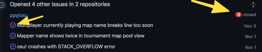
Adding to the above feedback, in some cases the new purple usage is actively misleading. See the following pull request thread: ppy/osu#15378 I closed the pull due to it being obviously bogus, but at the end of the thread, the action of me closing the pull without merging is shown with a purple icon. I had to have a double take to make sure I didn't accidentally merge this change, because merging it would result in the same colour of icon. |
Beta Was this translation helpful? Give feedback.
-
|
This is excellent feedback and not the intended behavior - we will look into what's causing the "issue closed" icon displaying for closed pull requests and address it. Thanks a lot for the report and cheers! |
Beta Was this translation helpful? Give feedback.
-
|
And 1 month after this release, no further actions have been taken from the team. Are you trying to pretend that nothing happened? |
Beta Was this translation helpful? Give feedback.
-
|
A Chrome/Firefox extension is available for anyone who wants to revert this change https://github.com/Katsute/GitHub-Red-Issues#readme |
Beta Was this translation helpful? Give feedback.
-
|
A folks! A fix has gone out for this! See this discussion 💟 |
Beta Was this translation helpful? Give feedback.
-
|
Sorry but the fix is only for PRs, not including issues. |
Beta Was this translation helpful? Give feedback.
-
|
As of October 26, 2021 the closed issues became purple in a lot of GitHub products. But there is still some red to be found.
Can these closed issues be changed to purple too? Or does this conflict with the fact that 'Closed as not planned', 'Won't fix' and 'Duplicate' are shown as gray? Its an long outstanding question among the community, but you updated them to purple almost 2.5 years ago. Shouldn't it be implemented everywhere?! |

Beta Was this translation helpful? Give feedback.
-
|
Almost a year later and this is still an ongoing annoyance. Can't GitHub change this behavior?! |

Beta Was this translation helpful? Give feedback.
Uh oh!
There was an error while loading. Please reload this page.
-
This is a feedback targeting the roadmap issue: github/roadmap#289 (comment) .
(I've also filed a ticket for this.)
Summary
Purple should only use when the issue is explicitly marked as Resolved. A closed issue could be accidently opened, spam, out of topic, or something else rather than won't fix and duplicate.
A good upgrade experiences should be opt-in, not opt-out, which means options can be added to the "Close issue" button like "Close as resolved", to explicitly marked as merged if it's not closed by a merged PR.
Examples:
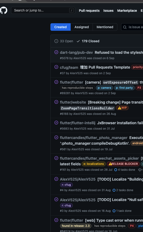
ZoomPageTransitionsBuilderflutter/website#6166 (discontinued)(As I writing this, I can still see the red indicator for closed issues in this discussion's preview.)
Issues that not closed by PR has an misleading CSS style (
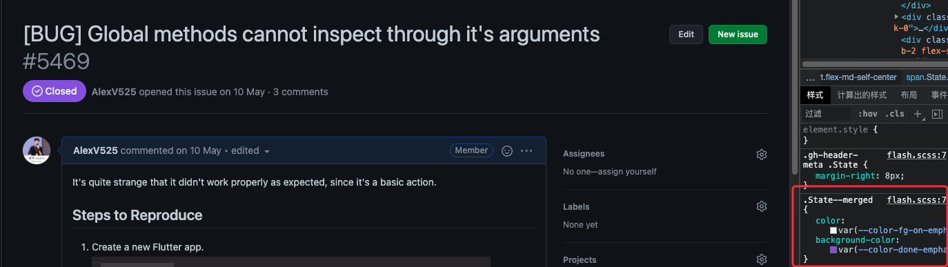
State--merged) too,Proposal/Solutions
To be honest, how can you tell these issues are closed but not resolved if there are no such words saying "closed"?
Beta Was this translation helpful? Give feedback.
All reactions