| title | CopilotSidebar |
|---|---|
| description | The CopilotSidebar component, providing a sidebar interface for interacting with your copilot. |
{ /*
- ATTENTION! DO NOT MODIFY THIS FILE!
- This page is auto-generated. If you want to make any changes to this page, changes must be made at:
- packages/react-ui/src/components/chat/Sidebar.tsx */ }
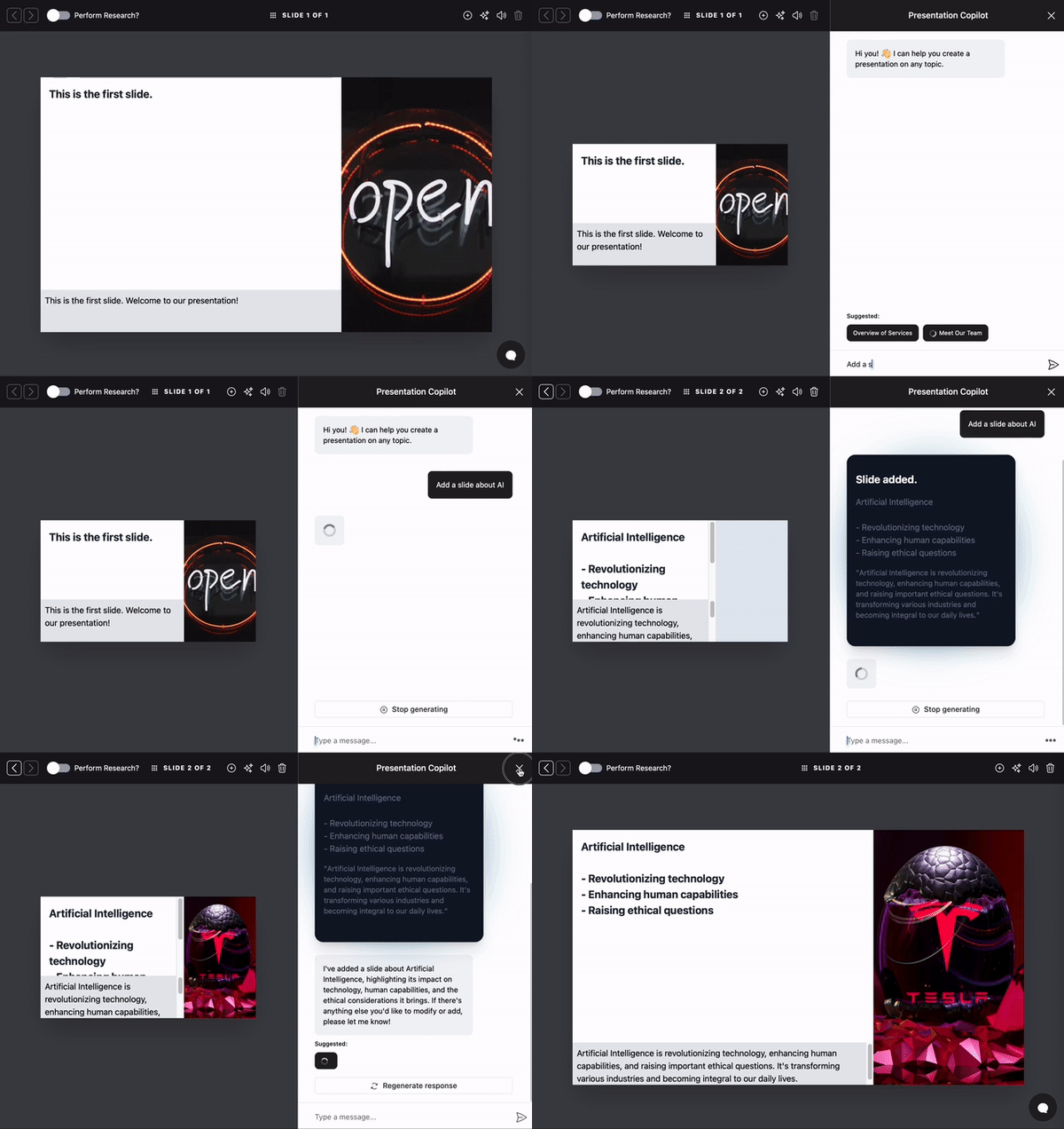
A chatbot sidebar component for the CopilotKit framework. Highly customizable through various props and custom CSS.
See CopilotPopup for a popup version of this component.
This component is part of the @copilotkit/react-ui package.
npm install @copilotkit/react-core @copilotkit/react-uiimport { CopilotSidebar } from "@copilotkit/react-ui";
import "@copilotkit/react-ui/styles.css";
<CopilotSidebar
labels={{
title: "Your Assistant",
initial: "Hi! 👋 How can I assist you today?",
}}
>
<YourApp/>
</CopilotSidebar>To monitor user interactions, provide the observabilityHooks prop.
Note: This requires a publicApiKey in the <CopilotKit> provider.
<CopilotKit publicApiKey="YOUR_PUBLIC_API_KEY">
  <CopilotSidebar
    observabilityHooks={{
      onChatExpanded: () => {
        console.log("Sidebar opened");
      },
      onChatMinimized: () => {
        console.log("Sidebar closed");
      },
    }}
  >
    <YourApp/>
  </CopilotSidebar>
</CopilotKit>By default, CopilotKit components do not have any styles. You can import CopilotKit's stylesheet at the root of your project:
...
import "@copilotkit/react-ui/styles.css"; // [!code highlight]

export function YourRootComponent() {
  return (
    <CopilotKit>
      ...
    </CopilotKit>
  );
}
For more information about how to customize the styles, check out the Customize Look & Feel guide.
Custom instructions to be added to the system message. Use this property to provide additional context or guidance to the language model, influencing its responses. These instructions can include specific directions, preferences, or criteria that the model should consider when generating its output, thereby tailoring the conversation more precisely to the user's needs or the application's requirements. Controls the behavior of suggestions in the chat interface.auto (default) - Suggestions are generated automatically:
- When the chat is first opened (empty state)
- After each message exchange completes
- Uses configuration from useCopilotChatSuggestions hooks
manual - Suggestions are controlled programmatically:
- Use setSuggestions() to set custom suggestions
- Use generateSuggestions() to trigger AI generation
- Access via useCopilotChat hook
SuggestionItem[] - Static suggestions array:
- Always shows the same suggestions
- No AI generation involved
@example
<CopilotChat
  attachments={{
    enabled: true,
    accept: "image,application/pdf",
    maxSize: 10  1024  1024, // 10MB
    onUpload: async (file) => {
      const url = await uploadToS3(file);
      return { url, mimeType: file.type };
    },
  }}
/>makeSystemMessage).
A custom assistant message component to use instead of the default.
A custom user message component to use instead of the default.
A custom error message component to use instead of the default.
A custom Messages component to use instead of the default.
A custom RenderMessage component to use instead of the default.
Warning: This is a break-glass solution to allow for custom rendering of messages. You are most likely looking to swap out the AssistantMessage and UserMessage components instead which are also props.
A custom suggestions list component to use instead of the default. A custom Input component to use instead of the default. A class name to apply to the root element. Children to render. Event hooks for CopilotKit chat events. These hooks only work when publicApiKey is provided. Custom error renderer for chat-specific errors. When provided, errors will be displayed inline within the chat interface. Optional handler for comprehensive debugging and observability. Whether the chat window should be open by default. If the chat window should close when the user clicks outside of it. If the chat window should close when the user hits the Escape key. The shortcut key to open the chat window. Uses Command-[shortcut] on a Mac and Ctrl-[shortcut] on Windows. A callback that gets called when the chat window opens or closes. A custom Window component to use instead of the default. A custom Button component to use instead of the default. A custom Header component to use instead of the default.