GitHub docs don't have sufficient contrast #53989
-
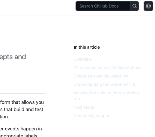
Select Topic AreaGeneral BodyIt's really hard to read the sidebars on the github docs due to the low contrast font color. Any way to increase the contrast, or is this an issue GitHub will need to resolve? This is using the latest version of Chrome. From https://docs.github.com/en/actions/learn-github-actions/understanding-github-actions:
|

Beta Was this translation helpful? Give feedback.
Replies: 5 comments
-
|
Upvoting this as I had to manually switch to dark mode in my Account. I suppose it has to do something with the dark mode tokens not being updated? |
Beta Was this translation helpful? Give feedback.
-
|
Same issue here. Looks like docs are partially ignoring theme preferences set in account settings and displays theme based on autodetected system preferences. |
Beta Was this translation helpful? Give feedback.
-
|
Have you looked at it recently? I just switched from dark mode to light mode and this is what I'm seeing on Chrome. I did, however, also turn off synch with system preferences. 
|
Beta Was this translation helpful? Give feedback.
-
|
I checked and in my case the contrast looks ok now. Theme mode in appearance settings set as sync with system or single theme, doesn't matter, in both cases GitHub and GitHub docs looks good in light/dark mode. Looks like the issue has been fixed. |
Beta Was this translation helpful? Give feedback.
-
|
Hello @melinath - this issue appears to be resolved per this comment. Could you please confirm and close this issue? Thank you! (cc @queenofcorgis) |
Beta Was this translation helpful? Give feedback.
I checked and in my case the contrast looks ok now. Theme mode in appearance settings set as sync with system or single theme, doesn't matter, in both cases GitHub and GitHub docs looks good in light/dark mode.
Looks like the issue has been fixed.