I do not like the "read more" UI #5979
-
|
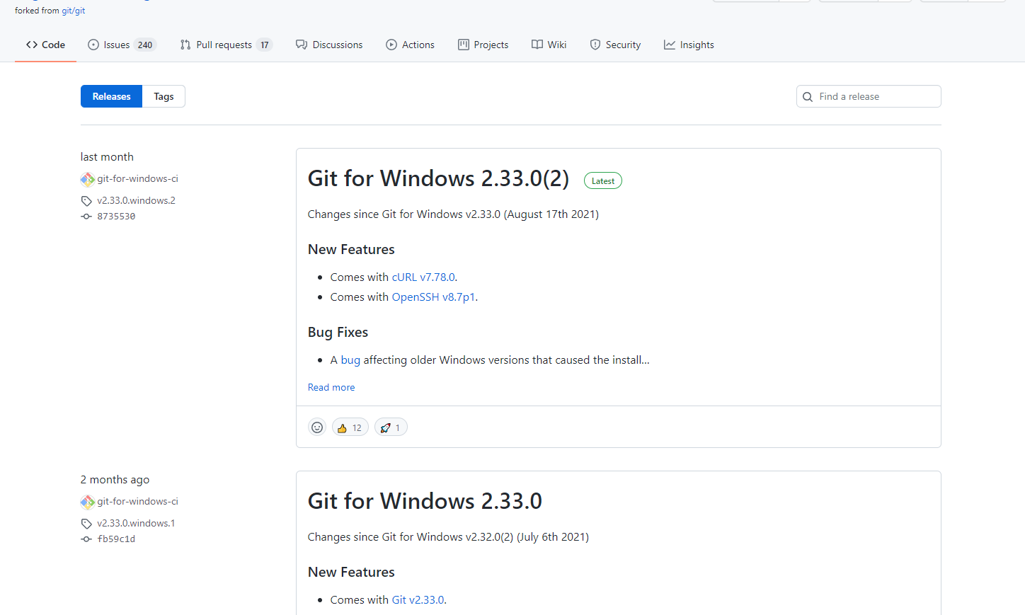
At the very least, the release notes should fully expand the latest release. Right now, with the new UI it just hides everything which is really not helpful. |
Beta Was this translation helpful? Give feedback.
Replies: 12 comments 30 replies
-
|
I second that. "Read more" should load the remaining text instead of opening a different page |
Beta Was this translation helpful? Give feedback.
-
|
+1 here, this makes it hard to check multiple releases easily. |
Beta Was this translation helpful? Give feedback.
-
|
Just make sure to load the page anyway, if client-side scripts are disabled. |
Beta Was this translation helpful? Give feedback.
-
|
This is now the behavior, PTAL. |
Beta Was this translation helpful? Give feedback.
-
|
I concur; would also like to see the latest post in full (including the downloads - how do I "get" the release?) and the following releases in a more compact representation. Perhaps use similar logic to how This release mostly focuses on fixing BGP routing alongside some small ui tweaks.
---
Commits
- ... |
Beta Was this translation helpful? Give feedback.
-
|
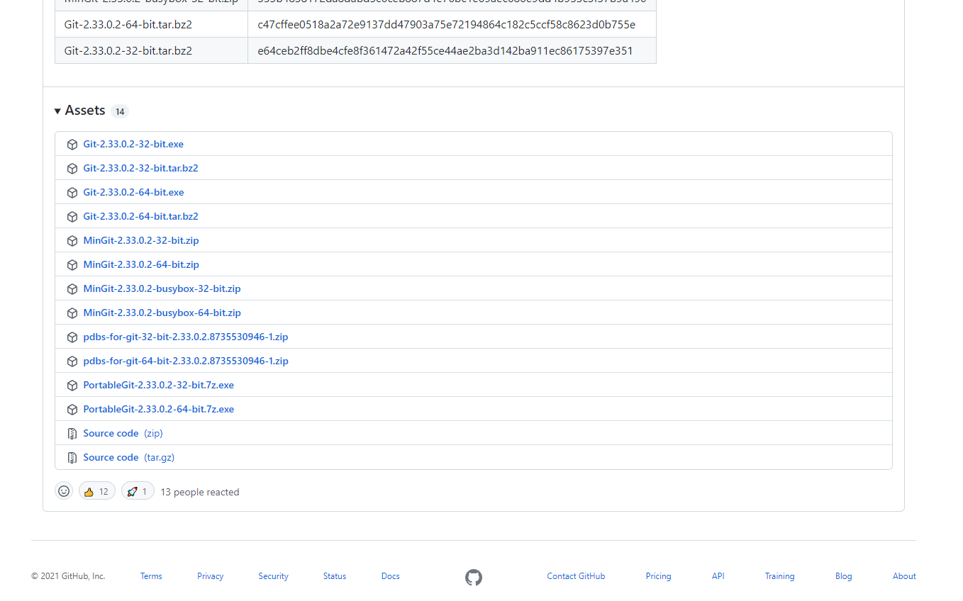
All downloads have been brought back to the list view. At this time we are not expanded the latest release by default as there is some inconsistency in how we identify / sort the latest release. Once we iron that out we'll likely make the latest release expand by default |
Beta Was this translation helpful? Give feedback.
-
|
Also, the page nav doesn't currently remember the scroll position (it's just a load in, like with React or something), so if you click Read more, scroll down, and then navigate back, you're suddenly lower down the previous page than you were. But really, besides the router code being too basic, this UI dedensification must stop. 1. Click on Read more
2. After scrolling down
3. Hit the back button
|
Beta Was this translation helpful? Give feedback.
-
|
I agree too, the "Read more" UI makes it really hard to find a specific release that introduced a feature by scrolling the releases page (like a changelog). I think Releases is better if it serves as a changelog rather than a summarised changelog. Too much content is hidden under the "Read more" link. |
Beta Was this translation helpful? Give feedback.
-
|
I completely agree. This is especially painful if you were a few versions behind, and would like to catch up on all changes from e.g. version 1.1 until 1.6. I always read through the release notes of all nuget-packages I am skipping over, hiding this partially behind "read more" makes thing harder. |
Beta Was this translation helpful? Give feedback.
-
|
For repositories with frequent releases, it has never been easy to search for specific changes across multiple releases but hiding text content behind a |
Beta Was this translation helpful? Give feedback.
-
|
To the UX designers of this new feature:
STORY: As a user I want find out when "feature X" was introduced or changed.
Proposal:
|
Beta Was this translation helpful? Give feedback.
-
|
We've made significant changes to the list view, please take a look and let us know if you think we can do more. |
Beta Was this translation helpful? Give feedback.
-
|
A nice workaround that works for me:
|
Beta Was this translation helpful? Give feedback.
-
|
Switched back to old UI in a second. Having to load another page to download assets. No. |
Beta Was this translation helpful? Give feedback.
-
|
We fixed the regression in which the list view didn't show assets. PTAL |
Beta Was this translation helpful? Give feedback.
-
|
We are having discussions about what we can do to improve the experience regarding the list view and the abridged content. We are also actively working on improving the search functionality. The number one reason folks have been bringing up that they want to see the full content is because they rely on searching the text of the page manually to find specific content. It feels to me like if we significantly improve the new search functionality and show unabridged content with highlights on the results page we could significantly improve the overall experience of finding specific details about releases which seems to be the primary user journey we are talking about here. |
Beta Was this translation helpful? Give feedback.
-
|
Please see my post which contains both critique plus proposal. Please consider it. |
Beta Was this translation helpful? Give feedback.
-
|
@florianschanda search in the browser only searches releases in the current window. Our updated search will query all releases in the history of the project. I do not believe that is a duplication of browser functionality |
Beta Was this translation helpful? Give feedback.
-
Please really see my proposal. Also contains idea for collapsible TOC and expand/collape all releases controls. |
Beta Was this translation helpful? Give feedback.
-
|
A pet peeve of mine is when websites get large enough to a point that they start trying to hijack or replace browser native features, like… search. I really don't mind search locally. I understand pagination means I have to load multiple pages, but as a technical person (I would imagine the average user who uses GitHub is at least somewhat technical) I would prefer having some escape hatch to just hit Cmd/Ctrl-F and just find the thing that interests me. Hiding things that you need to manually expand one-by-one and then replacing them with a non-native search kind of seems like solving an invented problem to me. I don't mind a collapse-all/expand-all button, but making things just a few lines tall break a lot of release notes as you can't even show enough to show the summary. |
Beta Was this translation helpful? Give feedback.
-
|
Yeah, i wonder what was a user story/case for this new design. Someone complained they are tired of scrolling? |
Beta Was this translation helpful? Give feedback.
-
|
For my project, the new releases look really broken:
I could imagine adding some Markdown tag to control where the preview is split. Furthermore, I don't understand why the latest release should have as much (or as little) space as all other releases. Maybe resizing the size of the latest release could be beneficial. |
Beta Was this translation helpful? Give feedback.
-
|
We are going to make the latest release show the full content. |
Beta Was this translation helpful? Give feedback.
-
Exactly. That would allow developers to break the release notes where they want them to break |
Beta Was this translation helpful? Give feedback.
-
|
To present a lot at once, it'd be nice to see the same data we see in the current UI, but with everything collapsed inline instead of different pages.
Even better, when a user expands/contracts one of these two expandos, remember that state. Whenever displaying a release, use the same state as the default so the user doesn't have to repeatedly expand/contract. |
Beta Was this translation helpful? Give feedback.
-
|
Assets are now back in the list view. I'm about to post an update in this discussion with the current plan for improving hidden content |
Beta Was this translation helpful? Give feedback.
-
|
In addition to this, it would be nice to have an "expand all" button or maybe just a user setting under "Appearance" that toggles such a feature. Allowing release text to be expanded inline would definitely be better than opening a different page for each one, but having to do this repeatedly still seems a bit tedious and regressive in comparison to the current UI. |
Beta Was this translation helpful? Give feedback.
-
|
We are exploring a single attribute that could be passed to do exactly this |
Beta Was this translation helpful? Give feedback.
-
|
As a quick update. We just shipped assets in the list view, which should fix a number of complaints. We are also exploring major changes to how we hide content in the list view and are in the process of doing an engineering spike to determine the exact implementation but are exploring the following
For the last two points we need to do some analysis of performance and determine what is the best path forward |
Beta Was this translation helpful? Give feedback.
-
|
Definitely a better direction already. Thanks for hearing us. |
Beta Was this translation helpful? Give feedback.
-
|
Another quick update. We've just shipped everything I mentioned above aside from highlighting search results. please take a look! |
Beta Was this translation helpful? Give feedback.
-
|
"An attribute to show full releases rather than abridge" how do I do this? |
Beta Was this translation helpful? Give feedback.
-
|
While I do like the overall look and feel of the new releases page, I find the abridged content for the release notes problematic. I feel that it is ultimately the responsibility of the release publisher to determine if abridged release note content is appropriate for their project, not the viewer. Likewise, I have always assumed the contract for release notes was "here is a block of Markdown, and it will be displayed—in full—for both list and detail views"; i.e. it is the release publisher who makes those notes short or long enough to be relevant for a given project. One alternative might be to have a "summary" field associated with releases that can be shown in the list view so release publishers can still control exactly how release notes are displayed. Another admittedly less friendly alternative could be to provide collapsible content sections via markup in the notes themselves. In my opinion, giving up this much control over the release presentation makes the feature less desirable overall: personally I see myself more likely to switch to a manually maintained changelog and hide the releases from the project home page. |
Beta Was this translation helpful? Give feedback.
-
|
Just more thinking out loud as I process this: I often place security notices or breaking changes for a release near the bottom of the release notes because it is closer to the asset links where the user ultimately clicks to download release content. With non-latest releases collapsed by default, these potentially important notices quickly get lost as patch releases roll out. |
Beta Was this translation helpful? Give feedback.
-
|
Beta Was this translation helpful? Give feedback.
-
|
@jgustie at this time we are not looking to extend or complicate GitHub flavored markdown or to have special markdown features specifically for releases. We explored this space but opted to not pursue it as things get quite complicated quite quickly. We want to have a consistent experience across GitHub and across repos and we use the same truncation tool across the platform. That doesn't mean we can't improve how we do truncation though! @porg the reason it isn't documented is because it isn't GitHub flavored markdown... it is simply inline HTML. There isn't GitHub flavored markdown specifically for |
Beta Was this translation helpful? Give feedback.
-
|
@MylesBorins Thanks for explaining the reason/policy behind. Closed my support community inquiry accordingly. |
Beta Was this translation helpful? Give feedback.
-
|
Hey all. We've shipped 3 major updates over the last 24 hours.
PTAL We'll have more fixes coming next week including expanding search results by default. Search syntax for searching releases in a repositoryYou can provide text in your search query which will be matched against the title, body, and tag of the repository's releases. You can also combine the following qualifiers to target specific releases.
|
Beta Was this translation helpful? Give feedback.
As a quick update.
We just shipped assets in the list view, which should fix a number of complaints. We are also exploring major changes to how we hide content in the list view and are in the process of doing an engineering spike to determine the exact implementation but are exploring the following
For the last two points we need to do some analysis of performance and determine what is the best path forward