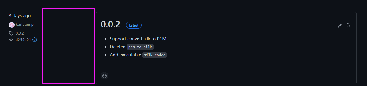
Release lists contains wide empty content #6041
-
|
It looks even stranger at higher resolutions.
|
Beta Was this translation helpful? Give feedback.
Replies: 5 comments
-
|
Yes. hate this new design idea to make everything bulkier and spacier. Instead of mobile versions of sites now everything is tailored for a touch input. |
Beta Was this translation helpful? Give feedback.
-
|
I've shared this feedback with our designer to see if there are any tweaks we can make here. That said we have had multiple discussions about the use of whitespace and this design is quite intentional, even if not to your preference. |
Beta Was this translation helpful? Give feedback.
-
|
This was my first thought upon enabling this feature preview. "wow, that's a lot of wasted space". I had to carefully read the existing feedback entries to find this complaint, but I was feeling sure someone else would've thought the same. |
Beta Was this translation helpful? Give feedback.
-
|
Adding to this, I also think the left column whitespace disconnects its content from the release itself. Just aligning it to the right again (like in previous design), close do the release details, would be better. Or, just get rid of the left column and use the new space inside the release details for this info. |
Beta Was this translation helpful? Give feedback.
-
|
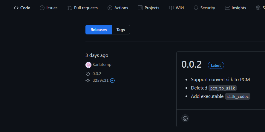
As an update we've tightened the space on the left column, PTAL |
Beta Was this translation helpful? Give feedback.
As an update we've tightened the space on the left column, PTAL